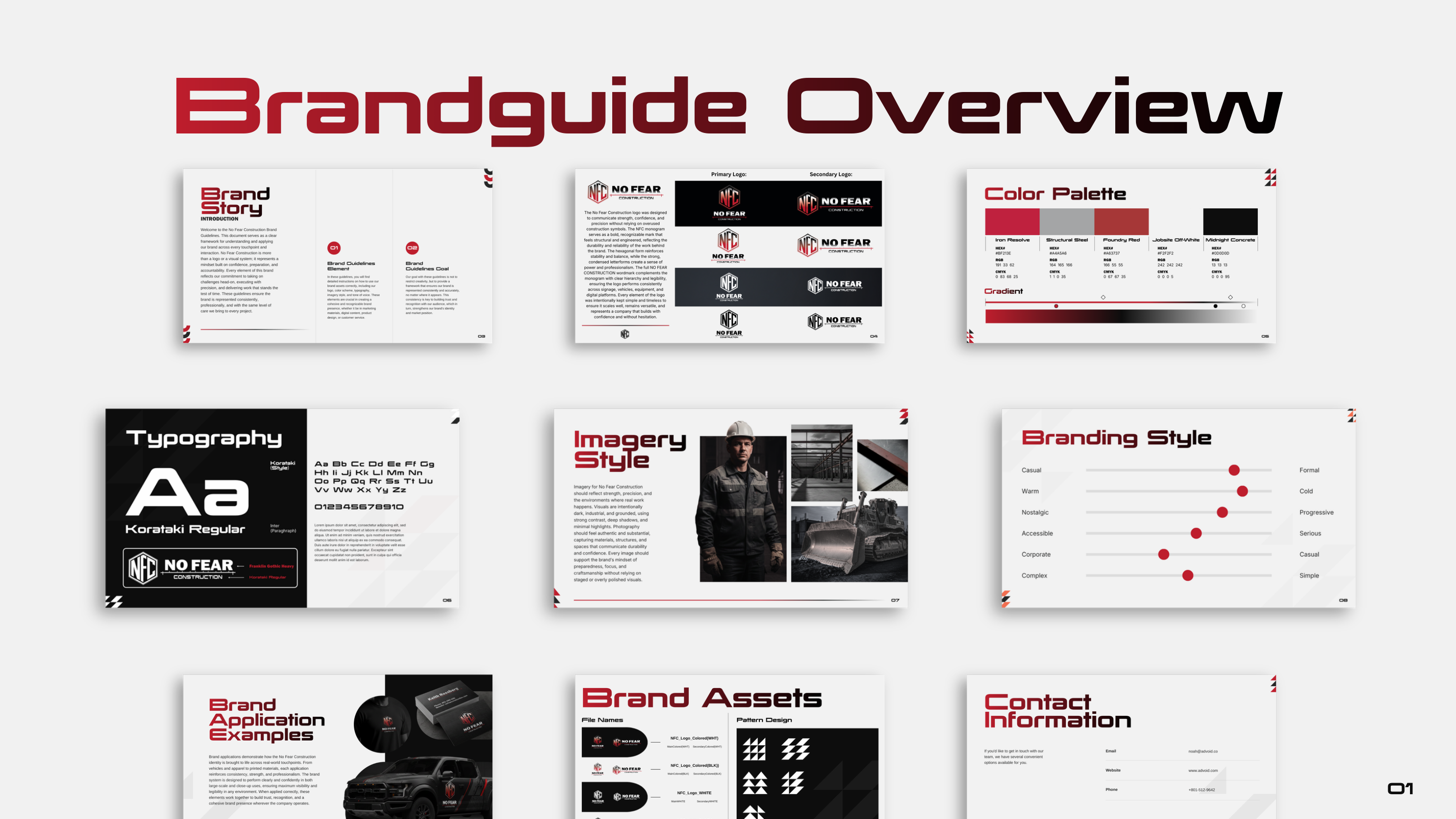
No Fear Construction needed a bold brand identity. We created a complete system with logo design, visual identity, and comprehensive brand guide for consistent application.
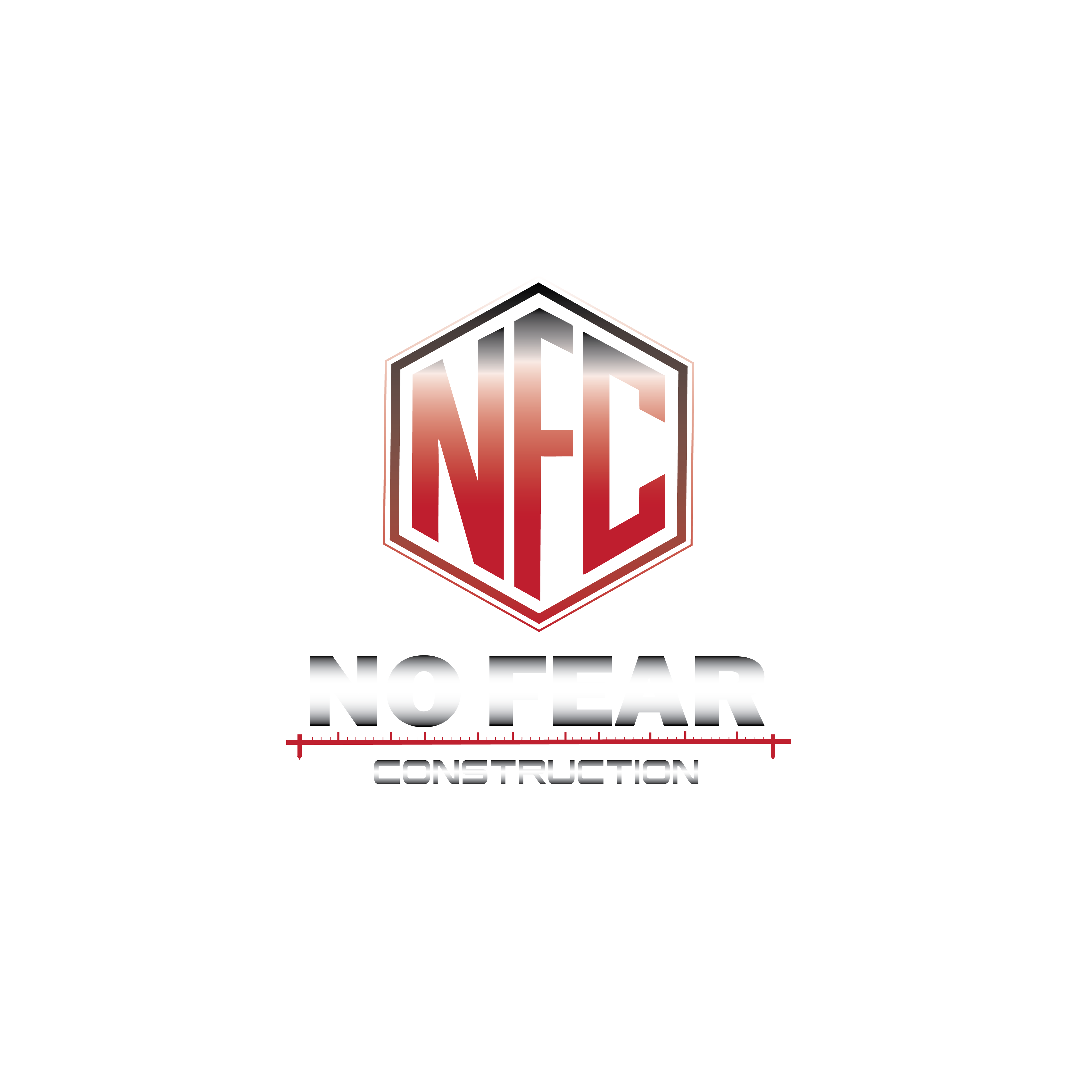
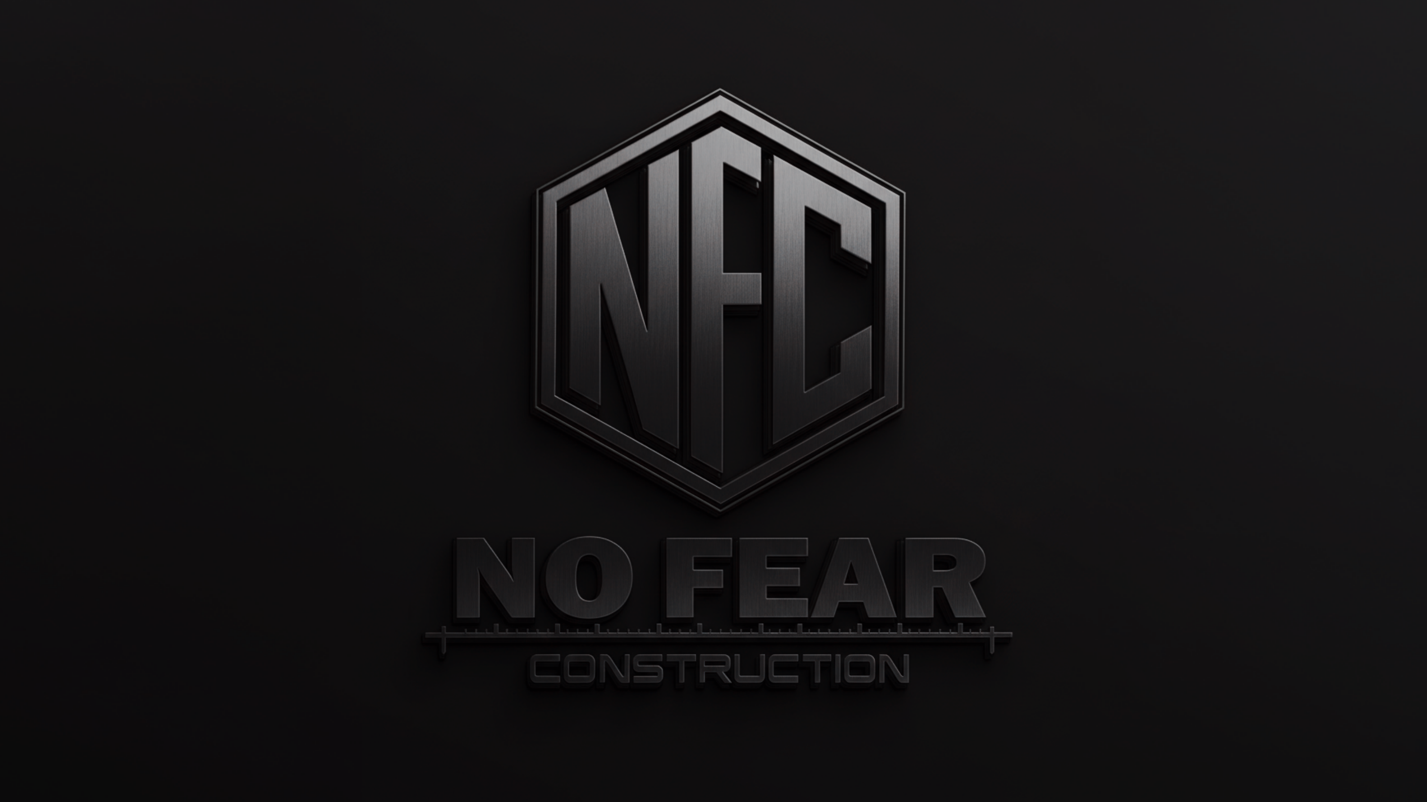
No Fear Construction is exactly what the name suggests — a company that tackles difficult projects with confidence. Their brand needed to reflect that boldness. We designed a shield-based logo, established a dark industrial color palette with metallic accents, and created a comprehensive brand guide documenting usage across all touchpoints.
The brand communicates strength, reliability, and precision. Metallic textures convey quality and durability. Bold typography commands attention. The shield logo serves as a symbol of protection and expertise. Every element was chosen to communicate what No Fear actually delivers: bold construction solutions backed by experience.
We started with the name — No Fear — and asked what that means visually. Strength. Stability. Boldness. We built a system around those qualities: dark, industrial aesthetic; metallic textures; powerful typography; a shield that communicates protection. Every design choice reinforces the same message: this is a company that gets the job done.
We design brands that match the strength of your work.
Start a Conversation →