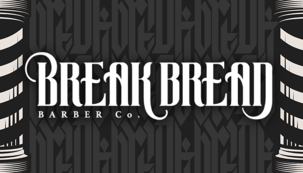
Break Bread Barber needed cohesive marketing materials across print and digital. We created a typographic-forward brand with heavy blackletter styling that communicates tradition and craft.
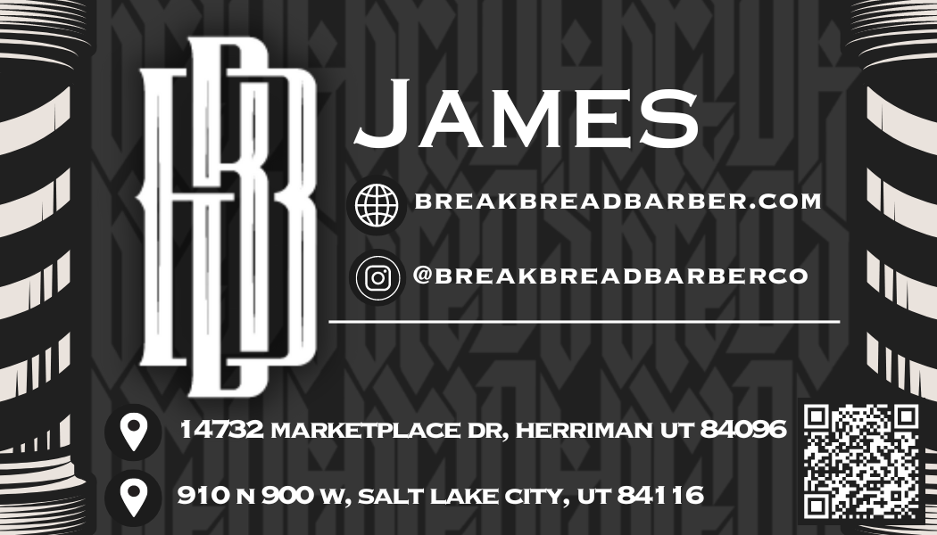
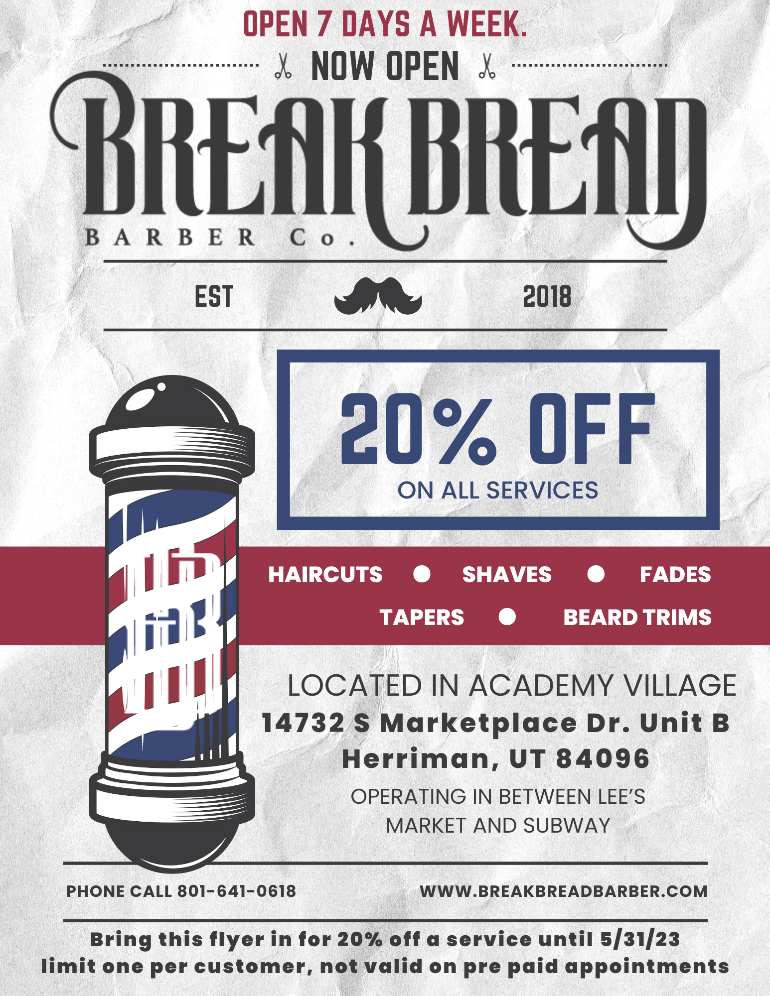
Break Bread Barber is rooted in craft and tradition. Their brand needed to communicate that through every touchpoint. We developed a strong typographic identity built around blackletter styling — classic, authoritative, deliberate. This foundation scaled across business cards, window signage, social media graphics, and digital assets.
Every piece was designed to work equally well in print and digital. Business cards that feel premium. Social posts that stop the scroll. Window displays that draw you in. The result is a brand that feels like it belongs in a barbershop — timeless, crafted, intentional.
We started with type. Blackletter for gravitas and tradition. Clean sans-serif for modern legibility. The combination communicates both heritage and contemporaneity. From that foundation, we built a system that worked across all mediums. Print materials that feel substantial. Digital designs that command attention. Every piece reinforces the same message: this is a place of craft.
We design systems that scale from business cards to billboards.
Start a Conversation →